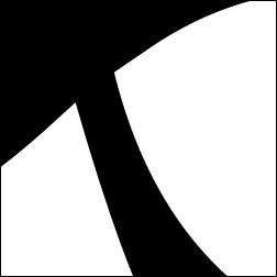
For project #2 we had to create a set of three symbols that represented ourselfs as an artist and our work. For this project I had some difficulty with coming up with words that described my work and my self as an artist but once I found a few I was able to jump right in to the project. For my symbols I decided to go with an older time, look and feel. So I used more traditional typefaces in the symbols as well as emphasized some aspects that gave the set as a whole that feel.
For the type based symbol I went through a lot of fonts before I found one that I liked, the creating of this symbol, was threefold because I first found the orientation I likes then I found one side of the symbol before finally finding the symbol as a whole.
The pictograph symbol while having a good initial design really needed some refinement to create a visually pleasing symbol, there were many renditions and decisions that went in to deciding what type of hat the banana should be wearing, after which I needed to find a way to bring the banana to life and give it some movement on the page.
The abstract symbol did not need as much work from paper to computer, other than some minor changes in how it sat on the page, for instance making sure that there was a good balance between the size of the individual components and the spacing between them. Over all I am really pleased with how my symbols turned out, an dhow they work as a cohesive whole that have similar elements but can stand on their own if the need to


